Plotting options
[1]:
import numpy as np
from pyphotomol import (
    MPAnalyzer,
    plot_histogram,
    plot_histograms_and_fits,
    AxisConfig,
    LayoutConfig,
    LegendConfig,
    PlotConfig
)

from scripts import display_figure_static # Only for static display, to be shown in GitHub
[2]:
file = '../test_files/demo.h5'
mp = MPAnalyzer()
files = [file] * 4
names = [f'demo{i+1}' for i in range(4)]
mp.import_files(files, names=names)
# Artificially count each mass two times for the first file
mp.models['demo1'].masses = np.repeat(mp.models['demo1'].masses, 2)
mp.apply_to_all('count_binding_events')
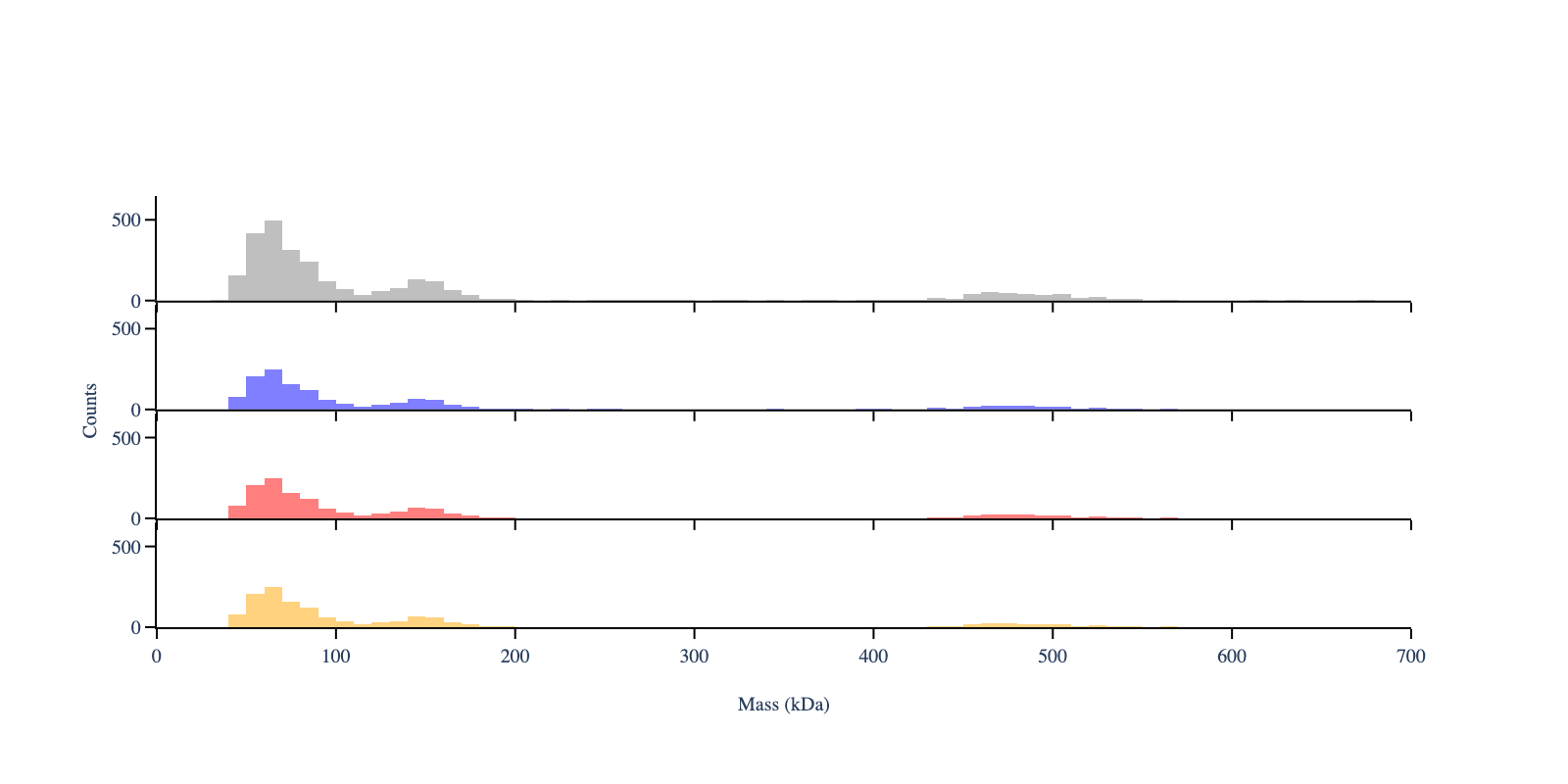
# Create the histogram - same window and bin width for all files
mp.apply_to_all('create_histogram',use_masses=True, window=[0, 800], bin_width=10)
[3]:
# Plot the mass distribution
colors = ['gray'] * len(files)

# Create configuration objects for customized plotting
layout_config = LayoutConfig(
    stacked=True,  # One plot per file
    show_subplot_titles=False,  # Hide subplot titles
    vertical_spacing=0.02,  # Vertical spacing between subplots
    shared_yaxes=True  # Share y-axes across subplots
)

plot_config = PlotConfig(
    x_range = [0,700]
)

fig = plot_histogram(mp,  # PhotoMol analyzer instance
                     colors,  # colors for each histogram
                     layout_config=layout_config,
                     plot_config=plot_config)

display_figure_static(fig, height=400)
# Replace line above with fig.show() to display the figure interactively
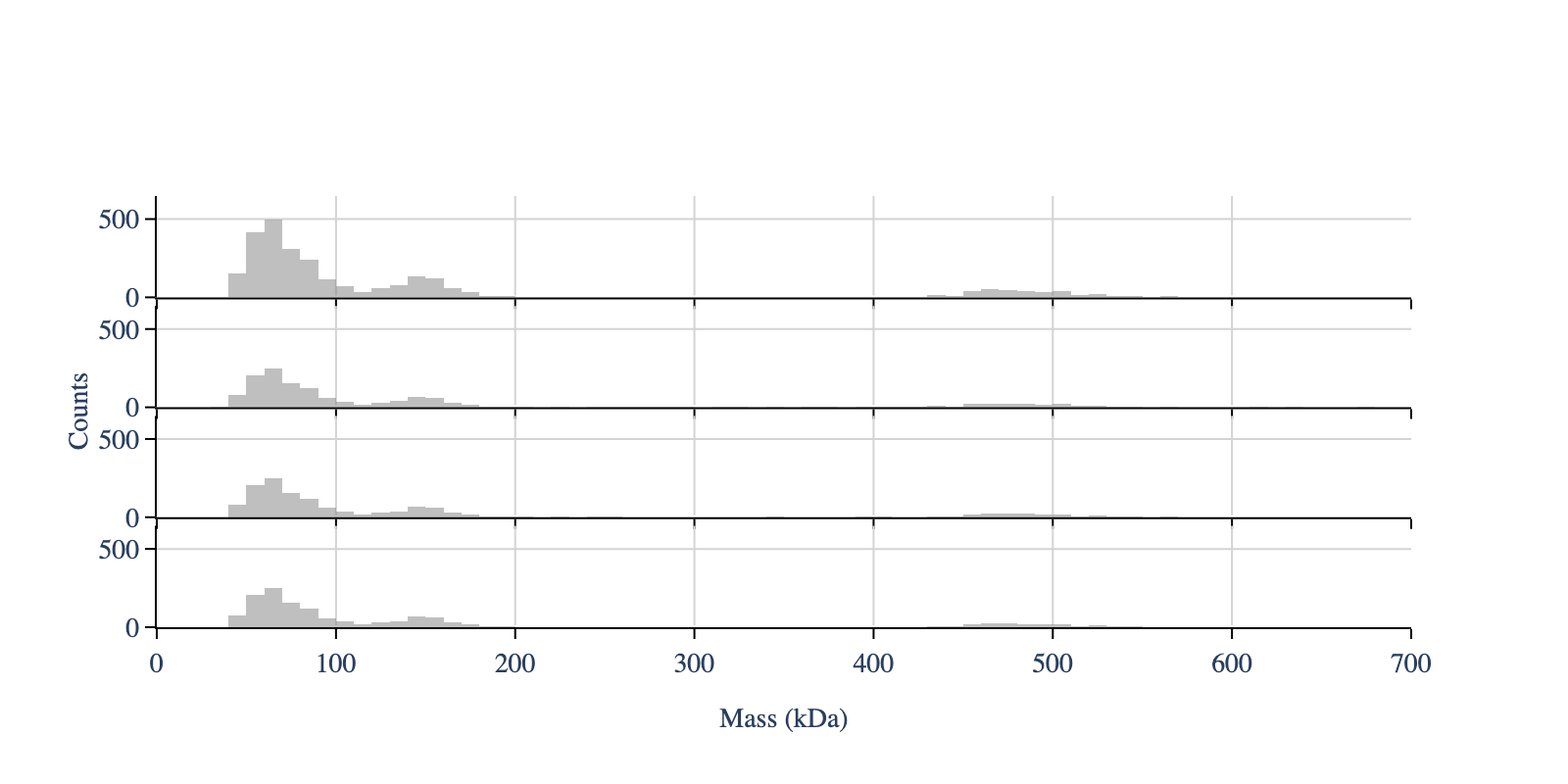
To overlap all histograms - set ‘stacked’ to False. In this case we only see one histogram, because all have the same data
[4]:
colors = ['green', 'blue', 'red', 'orange']

# Create configuration objects
plot_config = PlotConfig(
    font_size=18,
    x_range=[0, 700]
)

layout_config = LayoutConfig(
    stacked=False,  # One plot for all files
    vertical_spacing=0.01
)

fig = plot_histogram(mp,
                     colors,
                     plot_config=plot_config,
                     layout_config=layout_config)

display_figure_static(fig)
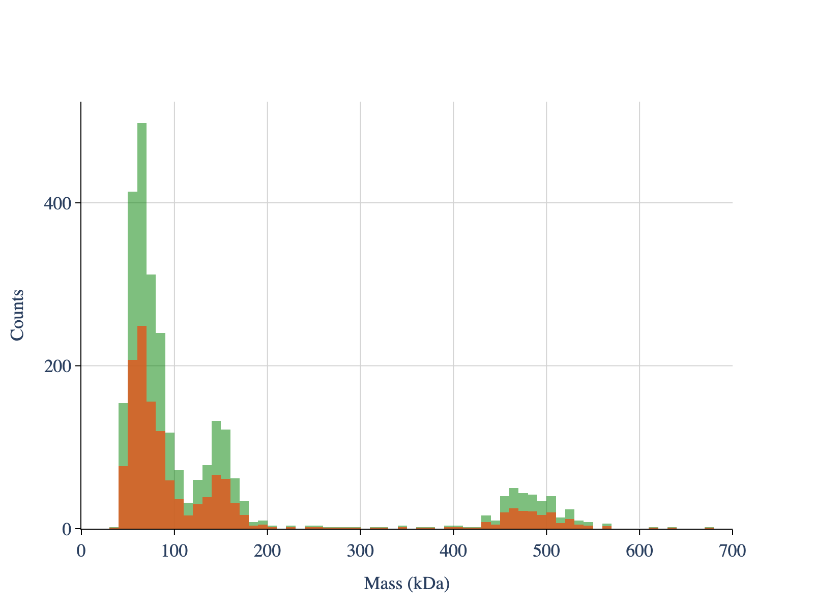
To normalise the histogram, set ‘normalize’ to True. To remove the grids, set ‘showgrid_x’ and ‘showgrid_y’ to False
[5]:
colors = ['gray', 'blue', 'red', 'orange']

# Create configuration objects
plot_config = PlotConfig(
    normalize=True,
    x_range=[0, 700]
)

axis_config = AxisConfig(
    showgrid_x=False,  # Hide x-axis grid lines
    showgrid_y=False   # Hide y-axis grid lines
)
layout_config = LayoutConfig(
    stacked=True,
    vertical_spacing=0.02,
    extra_padding_y_label=0.02
)

fig = plot_histogram(mp,
                     colors,
                     plot_config=plot_config,
                     axis_config=axis_config,
                     layout_config=layout_config)

display_figure_static(fig)
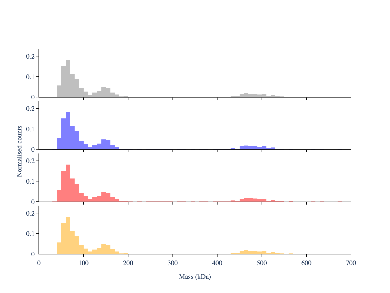
To control the font size, use the argument ‘font_size’
[6]:
# Create configuration objects
plot_config = PlotConfig(
    normalize=False,
    font_size=10,
    x_range=[0, 700]  # Set x-axis range
)
axis_config = AxisConfig(
    showgrid_x=False,
    showgrid_y=False
)
layout_config = LayoutConfig(
    stacked=True,
    vertical_spacing=0.01
)

fig = plot_histogram(mp,
                     colors,
                     plot_config=plot_config,
                     axis_config=axis_config,
                     layout_config=layout_config)

display_figure_static(fig, width=800, height=400)
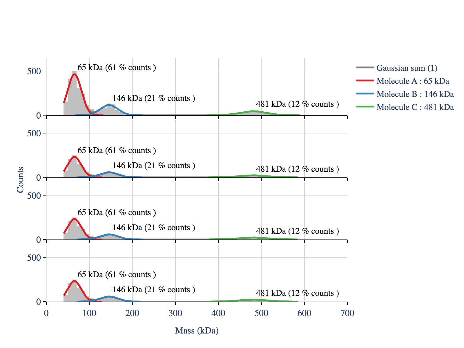
Apply the fitting
[7]:
# Estimate the peak positions - only to use later as a guess for the fit
# It uses scipy's find_peaks function under the hood
mp.apply_to_all('guess_peaks',min_height=10, min_distance=4, prominence=4)

# Extract the peaks positions
mp.get_properties('peaks_guess')
[7]:
[array([ 65., 145., 465., 505.]),
 array([ 65., 145., 465.]),
 array([ 65., 145., 465.]),
 array([ 65., 145., 465.])]
[8]:
# Fit the mass distribution using a multi gaussian
mp.apply_to_all(method_name='fit_histogram',
                peaks_guess=[65,145,465], # Initial peak guess, same for both files
                mean_tolerance=100, # Tolerance for the mean of the gaussian
                std_tolerance=100, # Tolerance for the standard deviation of the gaussian
                threshold=40, # Minimum observed value for the massses
                baseline=0) # Baseline value for the fit
[9]:
# Automatic generation of colors and legends for the histograms
legends_df, hist_df = mp.create_plotting_config(repeat_colors=False)

print(legends_df)
print('')
print(hist_df)

# Legends is the label, color is the color for the fitted lines and select is a boolean to
# control whether the trace is shown. show legend controls if the selected traces is also
# displayed in the legends text
             legends    color  select  show_legend
0   Gaussian sum (1)  #8DD3C7    True         True
1            Peak #1  #ADDFC1    True         True
2            Peak #2  #CDEBBB    True         True
3            Peak #3  #EDF8B6    True         True
4   Gaussian sum (2)  #F6F6B8    True         True
5            Peak #4  #E4E2C3    True         True
6            Peak #5  #D2CFCE    True         True
7            Peak #6  #BFBBD9    True         True
8   Gaussian sum (3)  #CDABBF    True         True
9            Peak #7  #DE9AA2    True         True
10           Peak #8  #F08A84    True         True
11           Peak #9  #EE857B    True         True
12  Gaussian sum (4)  #CB9297    True         True
13          Peak #10  #A9A0B2    True         True
14          Peak #11  #86AECE    True         True
15          Peak #12  #9CB1B8    True         True

  legends    color
0   demo1  #AEC6CF
1   demo2  #FFB347
2   demo3  #77DD77
3   demo4  #CFCFC4
To use always the same colors per histogram for the fitted curves, set ‘repeat_colors’ to True
[10]:
# Automatic generation of colors and legends for the histograms
legends_df, hist_df = mp.create_plotting_config(repeat_colors=True)

# Change same legends
legends_df.loc[1, 'legends'] = 'Molecule A'
legends_df.loc[2, 'legends'] = 'Molecule B'
legends_df.loc[3, 'legends'] = 'Molecule C'

print(legends_df)
             legends    color  select  show_legend
0   Gaussian sum (1)  #808080    True         True
1         Molecule A  #E41A1C    True         True
2         Molecule B  #377EB8    True         True
3         Molecule C  #4DAF4A    True         True
4   Gaussian sum (2)  #808080    True         True
5            Peak #4  #E41A1C    True         True
6            Peak #5  #377EB8    True         True
7            Peak #6  #4DAF4A    True         True
8   Gaussian sum (3)  #808080    True         True
9            Peak #7  #E41A1C    True         True
10           Peak #8  #377EB8    True         True
11           Peak #9  #4DAF4A    True         True
12  Gaussian sum (4)  #808080    True         True
13          Peak #10  #E41A1C    True         True
14          Peak #11  #377EB8    True         True
15          Peak #12  #4DAF4A    True         True
To show the fitted curves, but not all legends, use the column ‘show_legend’
[11]:
# The show_legend column in legends_df controls which legends are shown in the plot
legends_df['show_legend'] = False
legends_df.loc[:3, 'show_legend'] = True  # Show the first four legends

# Repeat colors for the histograms - do not use the colors from the hist_df
colors_hist = ['gray'] * len(hist_df)

# Create configuration objects
plot_config = PlotConfig(
    font_size=16,
    x_range=[0, 700]
)

layout_config = LayoutConfig(
    stacked=True,
    vertical_spacing=0.02,
    extra_padding_y_label=0.02
)

fig = plot_histograms_and_fits(mp,
                               legends_df=legends_df,
                               colors_hist=colors_hist,
                               plot_config=plot_config,
                               layout_config=layout_config)

display_figure_static(fig)
You can also control the
line width
whether to add the fitted masses to the plot
whether to add the counts percentage to the plot
whether to add the fitted masses to the legends
whether to add the counts percentage to the legends
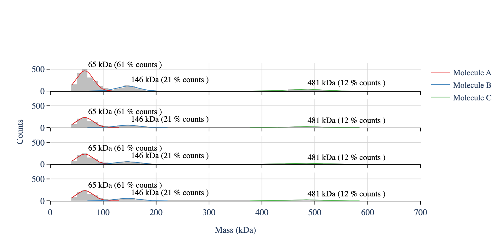
[12]:
legends_df.loc[0, 'select'] = False # Hide the multi-gaussian trace and legend

# Create configuration objects
plot_config = PlotConfig(
    font_size=14,
    x_range=[0, 700]
)

layout_config = LayoutConfig(
    stacked=True,
    vertical_spacing=0.06,
    extra_padding_y_label=0.02
)
legend_config = LegendConfig(
    add_masses_to_legend=False,
    add_percentage_to_legend=False,
    add_labels=True,  # Add labels in the plot
    add_percentages=True,  # Add count percentages in the plot
    line_width=1
)

fig = plot_histograms_and_fits(mp,
                               legends_df=legends_df,
                               colors_hist=colors_hist,
                               plot_config=plot_config,
                               layout_config=layout_config,
                               legend_config=legend_config)

display_figure_static(fig, width=800, height=400)